
Apple Music Undergo its First Brand Refresh in 11 Years
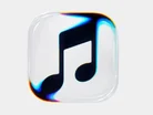
For the first time in 11 years, Apple Music has refreshed its brand identity.
The simplistically iconic red and white design has formed into a black and white styling, with mixed reviews flurrying social media.
The icon’s rebrand has been designed in collaboration with musician Fred Again using a pool of oil to pass sound waves.
Apple comments: “We partnered with one of the world’s best music artists to create the notes for the final mnemonic and then we used that sound to create the visuals.”

Made by sound
A creation video released by Apple revealed exactly how the brand recreated its music platform’s logo with sound and science.
A composition original to Apple Music was played through a shallow bath of mineral oil, while the ripples and frequencies were recorded and translated into physical vibrations.
The logo’s typography has also been updated to feature a custom version of Apple’s SF Pro typeface in a lowercase, bold letterform.
John Ternus, CEO of Apple, has frequently emphasised “design means everything to us” both within the brand’s products and its advertising materials. The brand’s refresh demonstrates a modern shift with a clean, duotone logo with an identity that comes straight from the product it is selling – music.
Wider changes, united fronts
For a leading technology company, rebranding isn’t particularly essential, especially for its music streaming platform. So why do it?
Apple Music’s rebrand aligns with wider developments within Apple’s software, ahead of the iOS 27.2 software update rolling out to users next week. The beta release saw darker widgets and a blue tab bar and so Apple Music’s new logo fits the darker aesthetic perfectly.
Some users have taken to social media to state that they will miss the original red design, and to not 'fix what isn’t broken'. Others, though, have welcomed the change and expressed their fondness for the new logo. Apple is seemingly committed to its new creative direction.
For Apple, minimalistic designs seems to have retired and the retro-inspired rebrand comes shortly after the release of the new iPhone Duo, which also brings a modern twist to nostalgia with the flip screen feature.
After being in the making for 10 years, and repeatedly tested for its quality and durability rates, Chief Marketing Officer Greg Joswiak said: “The product quality that we have… there’s nobody in the industry close to what we have.”
Design means everything to us"
The Apple Music rebrand could signal a wider rebrand for Apple’s iconic designs like the photos app or the iCloud Mail services, yet nothing has been revealed by Apple yet.
- Apple Music has rebranded for the first time in 11 years, swapping its red-and-white identity for a black-and-white duotone design.
- The logo was made with sound. Working with musician Fred Again, Apple played an original composition through a shallow bath of mineral oil and translated the resulting ripples and frequencies into the logo’s visuals.
- The wordmark now uses a custom lowercase and bold version of Apple’s SF Pro typeface.
- The rebrand arrives ahead of the iOS 27.2 update, whose beta already, matching the re-brand's aesthetic with darker widgets and a blue tab bar.
- Not everyone welcomed the change, but some users expressed fondness for the new logo.
Who are Apple's biggest collaborators?
- Google: Apple announced in 2024 that it would integrate OpenAI’s ChatGPT into iOS, letting users access its tools on their devices.
- Formula 1: Apple signed a five-year deal making Apple TV the exclusive US home of every F1 race from 2026. It will also promote the sport across Apple News, Maps, Music and Fitness+.
- OpenAI: Apple confirmed the OpenAI partnership at WWDC in June 2024, bringing ChatGPT into Siri and Apple Intelligence, with Siri asking permission first. Siri doesn’t rely on OpenAI’s models for most responses.




Executives

John Ternus
CEO